Paris 2024 Olympic Games – Brand design
A creative sprint for the Olympic Games!
A few months ago, Graphéine’s team studied the question of the visual identity of the 2024 Paris Olympic Games. Imagine an impossible timetable (only 3 weeks to send a response….) and all the conditions that we usually denounce (no financial compensation for submitting a project). Nevertheless… it’s the Olympic Games! What’s more, in Paris, our city capital! So we offered a creative sprint to our teams. 48 hours to find an idea. Here is the project we have collectively imagined.
Concept of the logo:
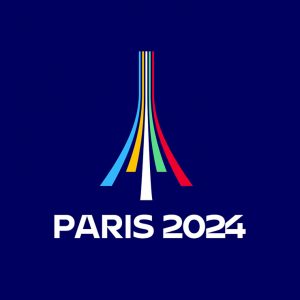
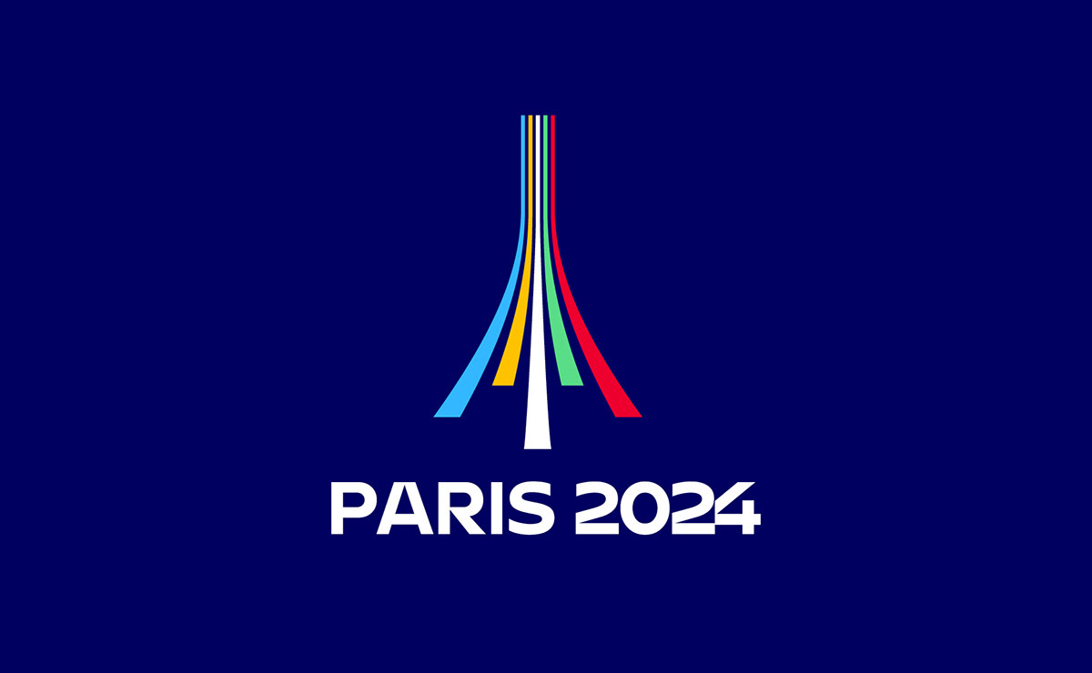
An Eiffel Tower sports track
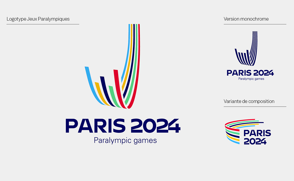
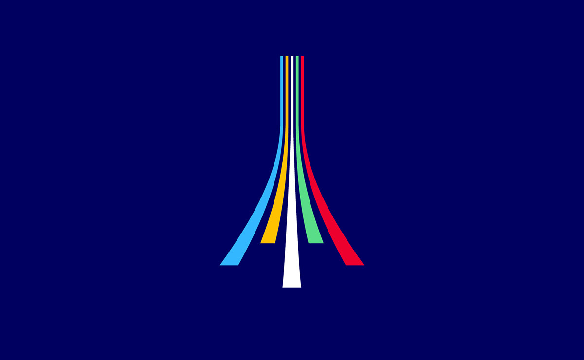
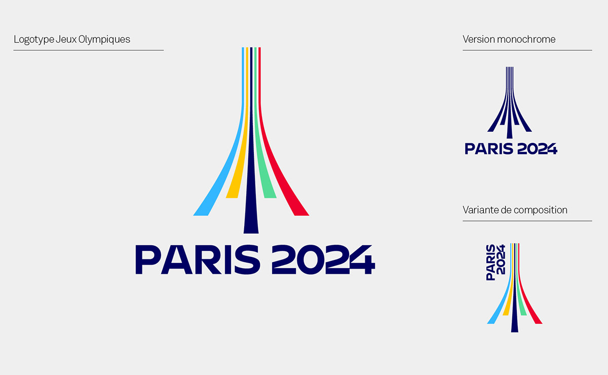
A sporty boost: Fluid curves, fast lines. A sports track emerges before our eyes, telling the story of movement and speed.
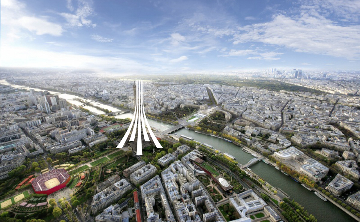
The Eiffel Tower: Solidly placed on the ground, a 3D Eiffel Tower is emerging.  The magic of this sign comes from its possible double reading. In turn sports track and Eiffel Tower. The eye seems not to want to choose.
An encounter: A logo that tells a story of encounter and convergence. It is a profoundly humanistic and optimistic sign that offers a perspective of collective progress.
An invitation to the world: 5 colours, 5 continents, all start off fairly on the track. The perspective of these lines seems to open generously to our gaze, as an invitation to participate in the celebration.
Citius – Altius – Fortius: Faster, higher, stronger… This sign echoes the IOC motto with the symbol of the Eiffel Tower. It affirms the audacity to go further, thus illustrating the idea of surpassing oneself.
Two logos for a shared vision
 
The two logos are from the same shape. A simple change of angle of view makes it possible to switch from the logo of the Olympic Games to that of the Paralympic Games. This symbolic rapprochement between the two logos is a strong gesture that can act as a bridge between the world of able-bodied athletes and that of athletes with disabilities.
A logical evolution….
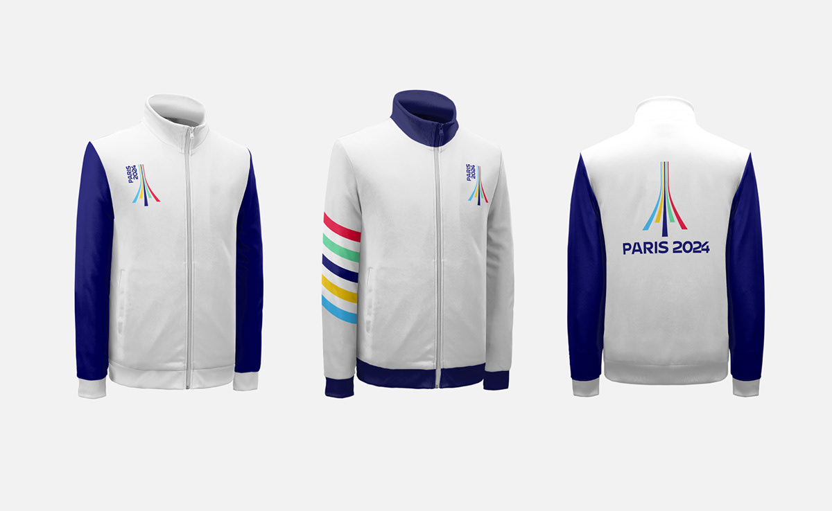
This logo proposal is an extension of the candidature logo. In addition to the Eiffel Tower, which remains the central element, we can find the idea of “3D strips” as well as a similar chromatic logic. It is a question of continuity, while bringing a form of maturity to the logo.
A history of links
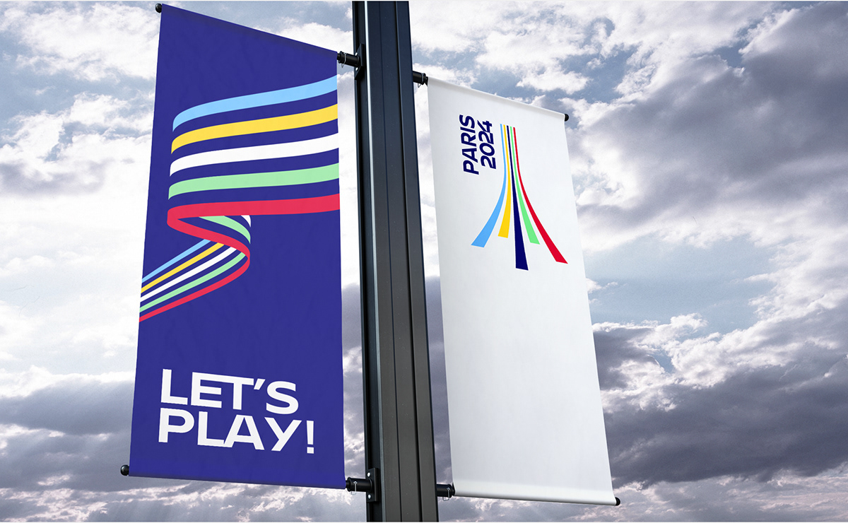
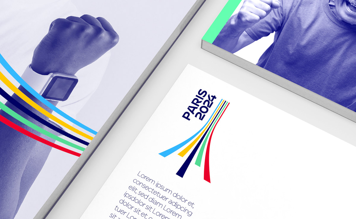
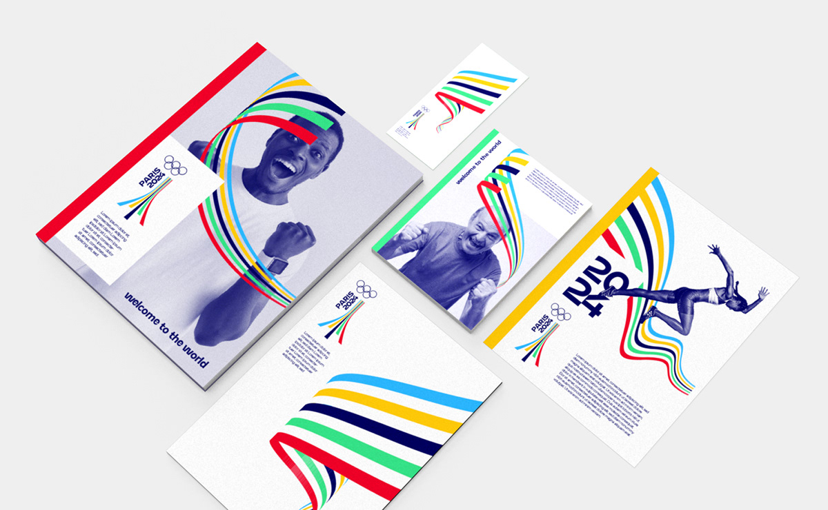
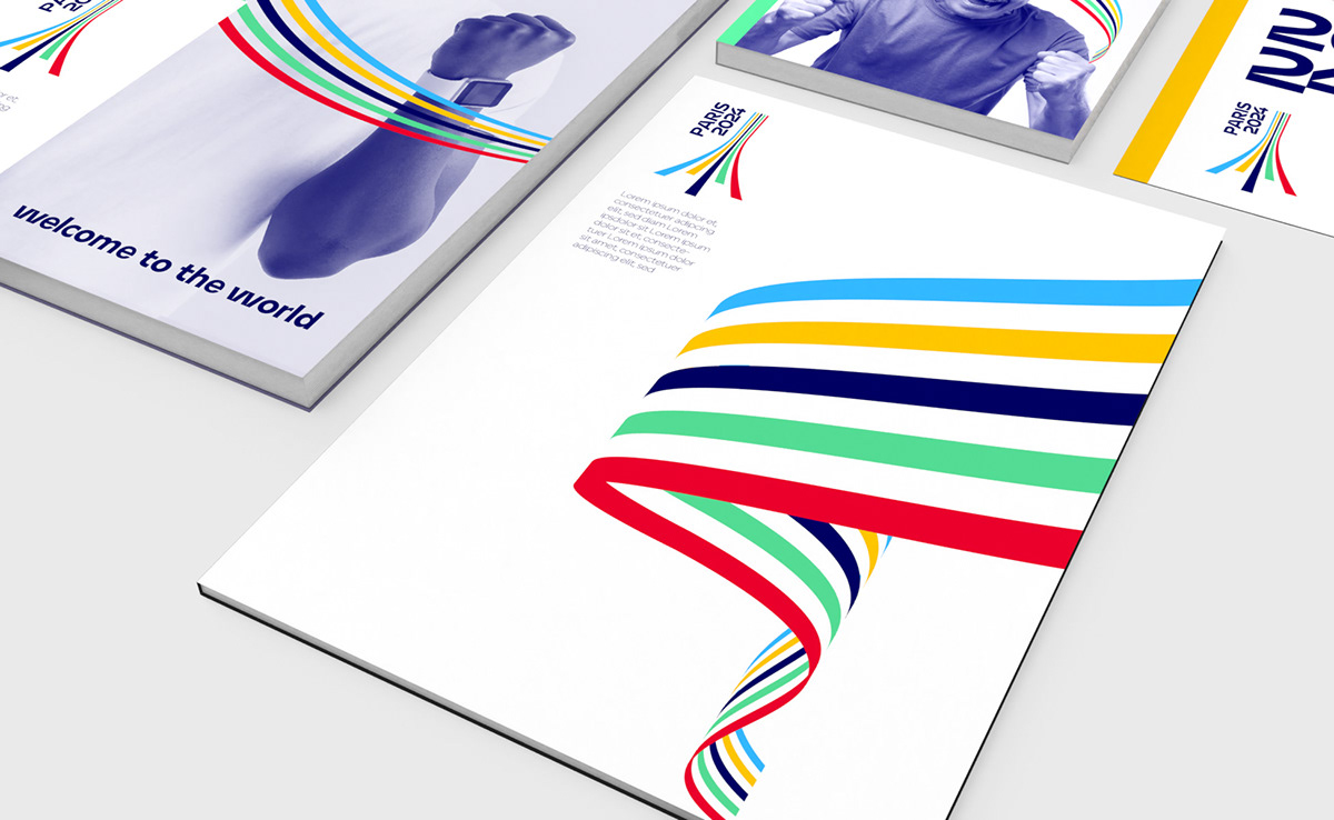
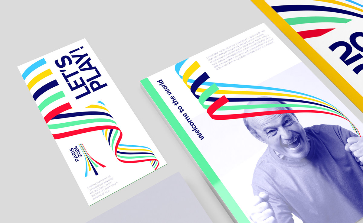
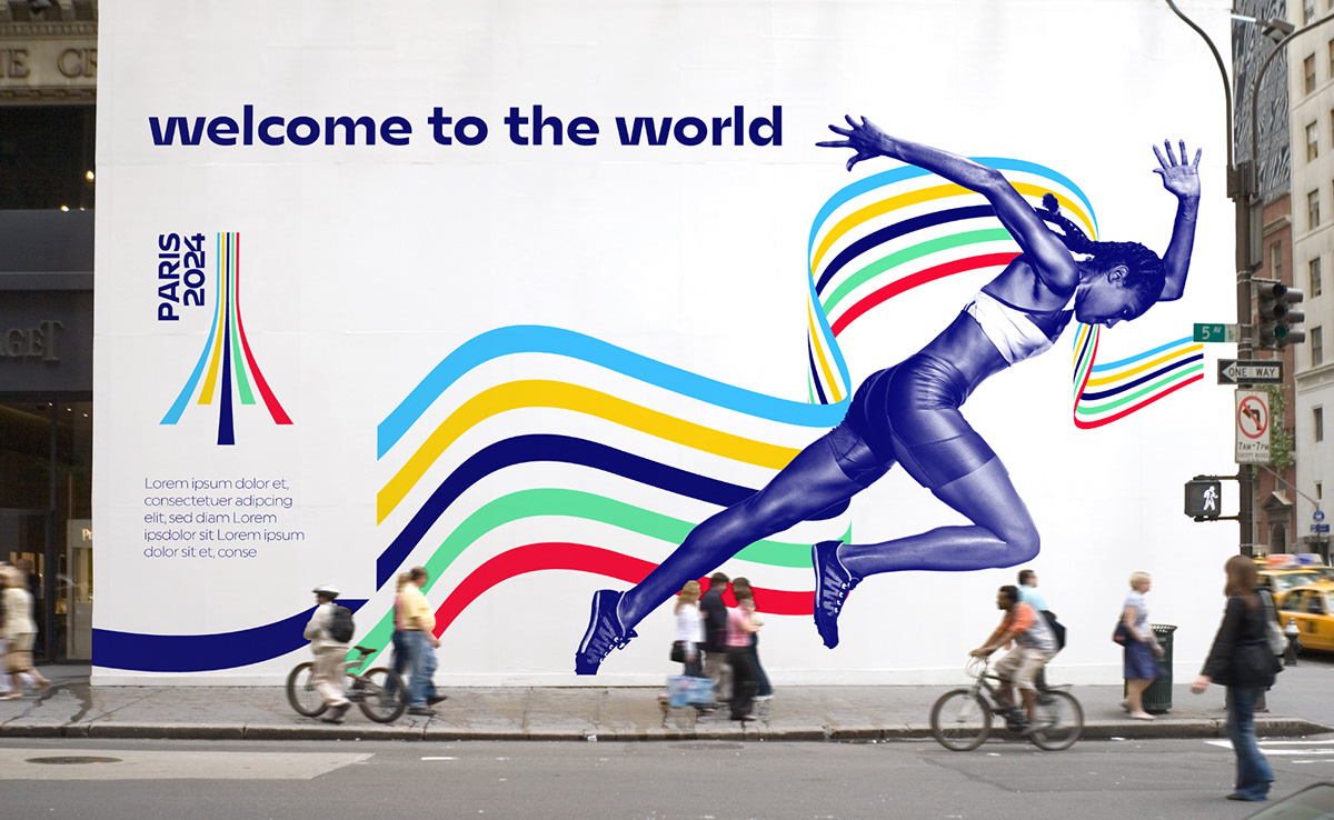
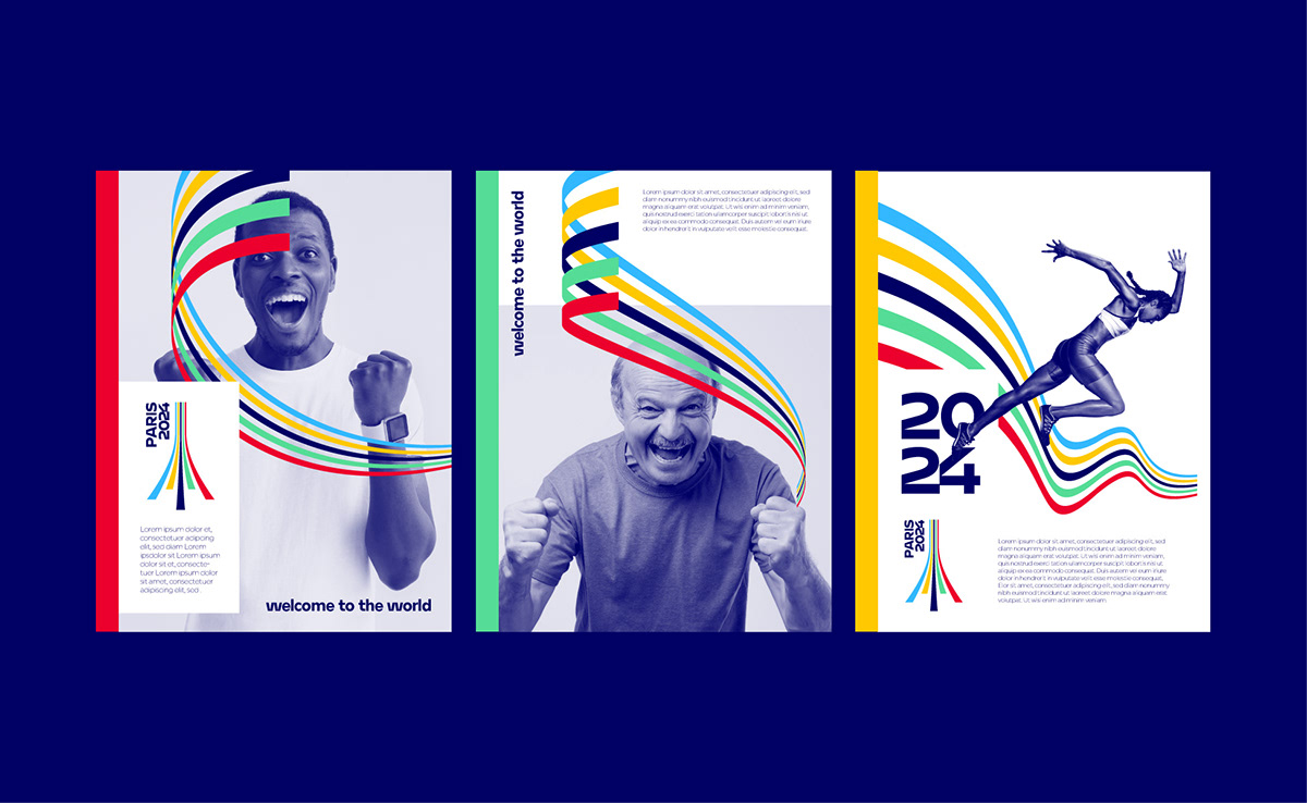
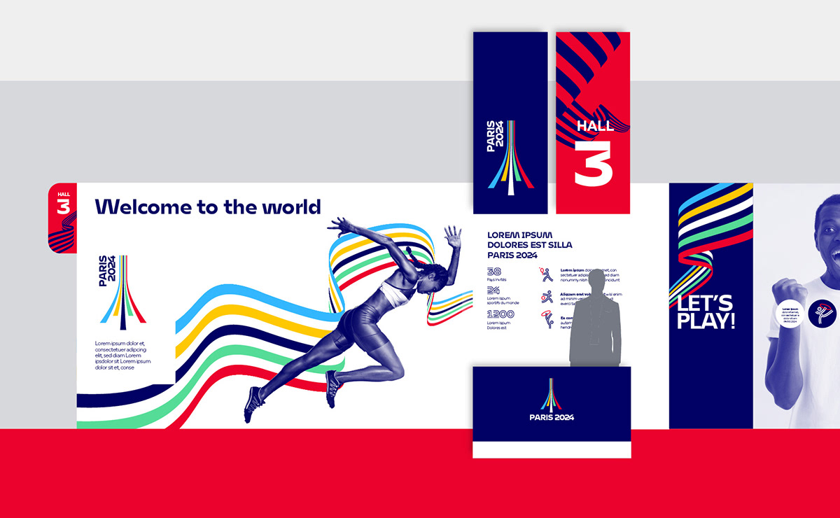
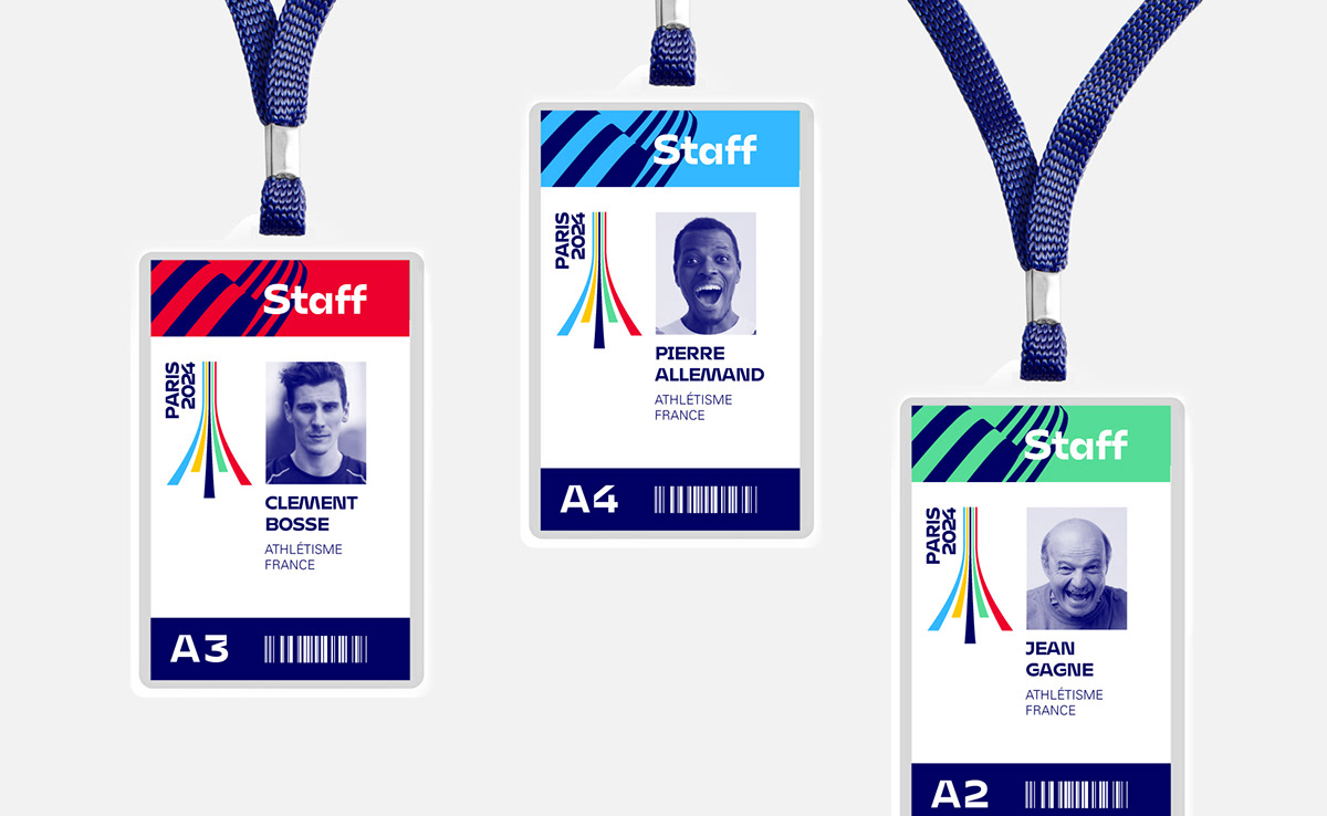
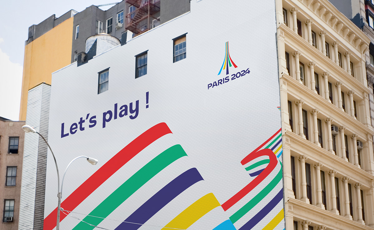
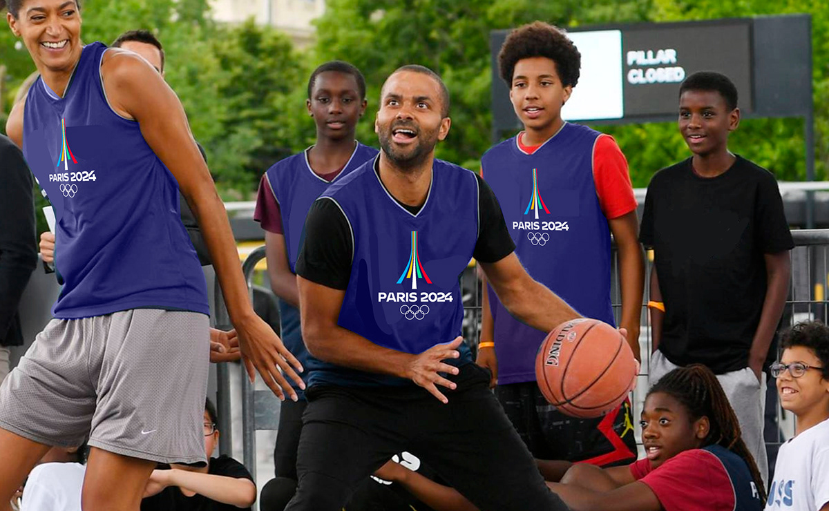
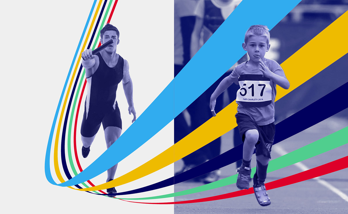
As it unfolds, the logo becomes the guiding thread of the visual universe. Like a ribbon that unfolds, it sets the rhythm of the layouts. This ribbon will also make possible to weave links between images, as if to connect actors and spectators, champions and champions’ seeds!
This project was not selected… But, as Pierre de Coubertin said, the most important thing is to participate!
Erratum: I get slipped into the earpiece that the expression “The essential thing is to participate” is not by Pierre de Coubertin! He would have borrowed it, like nothing, from the Bishop of Pennsylvania who was celebrating Mass at the first London Games. It is like the Olympic motto: “faster, higher, stronger”, which he recovered from Albert le Grand College in Arcueil (France)…
See more:
上一篇 下一篇
Paris 2024 Olympic Games – Brand design

A creative sprint for the Olympic Games!
A few months ago, Graphéine’s team studied the question of the visual identity of the 2024 Paris Olympic Games. Imagine an impossible timetable (only 3 weeks to send a response….) and all the conditions that we usually denounce (no financial compensation for submitting a project). Nevertheless… it’s the Olympic Games! What’s more, in Paris, our city capital! So we offered a creative sprint to our teams. 48 hours to find an idea. Here is the project we have collectively imagined.
Concept of the logo:
An Eiffel Tower sports track
A sporty boost: Fluid curves, fast lines. A sports track emerges before our eyes, telling the story of movement and speed.
The Eiffel Tower: Solidly placed on the ground, a 3D Eiffel Tower is emerging.  The magic of this sign comes from its possible double reading. In turn sports track and Eiffel Tower. The eye seems not to want to choose.
An encounter: A logo that tells a story of encounter and convergence. It is a profoundly humanistic and optimistic sign that offers a perspective of collective progress.
An invitation to the world: 5 colours, 5 continents, all start off fairly on the track. The perspective of these lines seems to open generously to our gaze, as an invitation to participate in the celebration.
Citius – Altius – Fortius: Faster, higher, stronger… This sign echoes the IOC motto with the symbol of the Eiffel Tower. It affirms the audacity to go further, thus illustrating the idea of surpassing oneself.
Two logos for a shared vision
 
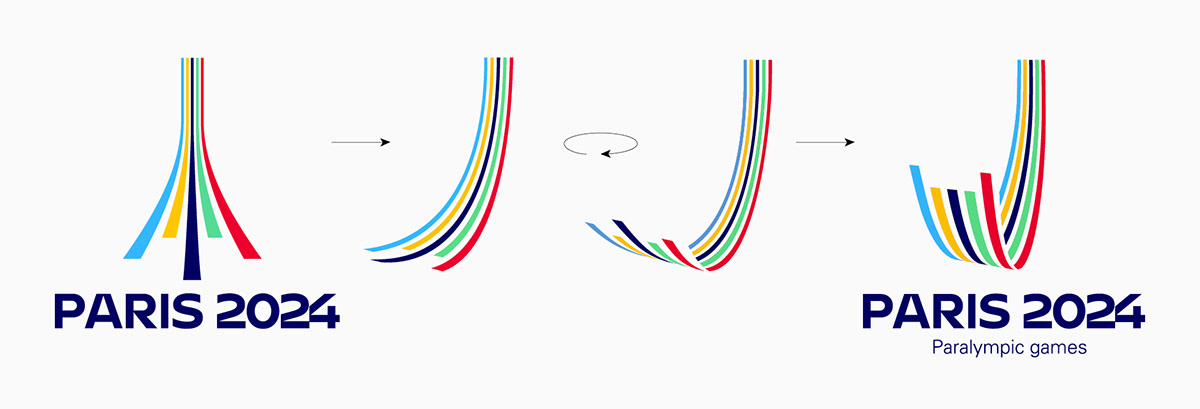
The two logos are from the same shape. A simple change of angle of view makes it possible to switch from the logo of the Olympic Games to that of the Paralympic Games. This symbolic rapprochement between the two logos is a strong gesture that can act as a bridge between the world of able-bodied athletes and that of athletes with disabilities.
A logical evolution….
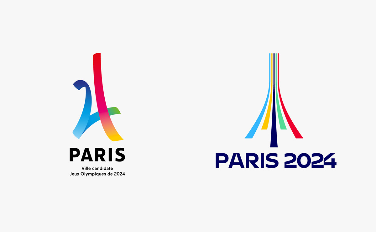
This logo proposal is an extension of the candidature logo. In addition to the Eiffel Tower, which remains the central element, we can find the idea of “3D strips” as well as a similar chromatic logic. It is a question of continuity, while bringing a form of maturity to the logo.
A history of links
As it unfolds, the logo becomes the guiding thread of the visual universe. Like a ribbon that unfolds, it sets the rhythm of the layouts. This ribbon will also make possible to weave links between images, as if to connect actors and spectators, champions and champions’ seeds!
This project was not selected… But, as Pierre de Coubertin said, the most important thing is to participate!
Erratum: I get slipped into the earpiece that the expression “The essential thing is to participate” is not by Pierre de Coubertin! He would have borrowed it, like nothing, from the Bishop of Pennsylvania who was celebrating Mass at the first London Games. It is like the Olympic motto: “faster, higher, stronger”, which he recovered from Albert le Grand College in Arcueil (France)…
See more:
© CopyRight 2011-2020 Mlito.COM Inc.All Rights Reserved . 苏ICP备16061420号 - 1